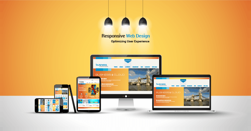
Understanding the Principles of Responsive Web Design
Responsive Web Design is crucial in today’s digital landscape, where users access websites from a myriad of devices. The core principle behind responsive design is to ensure that a website’s layout adapts seamlessly to various screen sizes, orientations, and resolutions. This is achieved through fluid grids, flexible images, and CSS media queries. By leveraging these techniques, designers can create an optimal viewing experience that does not require users to manually adjust their screens, improving navigation and user satisfaction.
One of the key advantages of adopting Responsive Web Design is its positive impact on SEO. Search engines, like Google, prioritize websites that offer a good user experience across all devices. By implementing responsive design, site owners can avoid issues like duplicate content that arise when separate mobile and desktop versions of a site are maintained. Moreover, a single responsive website improves loading times and boosts engagement metrics, which are all essential factors enhancing your site’s visibility on search engine results pages.
The Benefits of Adopting a Responsive Approach
Adopting a responsive approach offers numerous benefits that significantly enhance user experience across various devices. With the rapid increase in mobile internet usage, having a site that adapts seamlessly to different screen sizes is no longer optional but essential. A responsive design ensures that content is easily accessible and visually appealing, regardless of whether users are browsing on smartphones, tablets, or desktops. This adaptability not only improves usability but also boosts engagement, as visitors are more likely to stay on a site that delivers a consistent and enjoyable experience.
Additionally, a responsive approach contributes positively to your site's search engine optimization (SEO) efforts. Search engines, like Google, prioritize mobile-friendly sites in their rankings, meaning that a responsive design can significantly improve your visibility in search results. By consolidating your website’s URLs and optimizing your content for all devices, you can reduce bounce rates and increase dwell time, which are critical factors in achieving higher search rankings. In summary, adopting a responsive approach not only enhances user satisfaction but also supports your SEO strategy.
How to Optimize Images for a Responsive Layout
When it comes to optimizing images for a responsive layout, the first step is to choose the right image format. Consider using formats like JPEG for photographs, PNG for images that require transparency, and SVG for logos and icons, as they scale well without losing quality. Additionally, use an image compression tool to reduce file sizes without sacrificing quality. This helps improve loading times, ensuring your site loads quickly on all devices, which is a crucial factor for SEO.
Another important aspect of optimizing images for a responsive layout is implementing the srcset attribute in your HTML. This allows you to provide multiple versions of an image, ensuring that the browser selects the most appropriate one based on the user's screen size and resolution. For example, you can include low-resolution images for mobile devices and high-resolution images for desktops. Additionally, always remember to include descriptive alt text for each image to enhance accessibility and improve your site's SEO ranking.