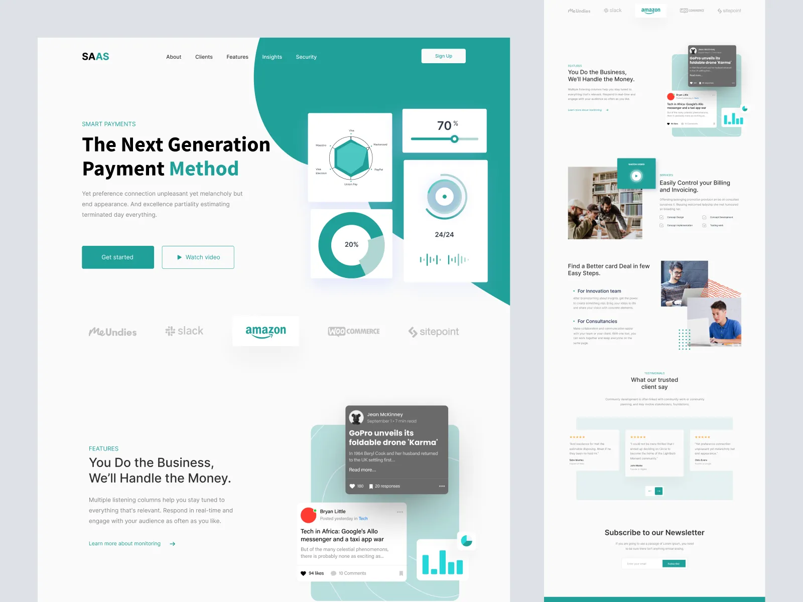
10 Key Elements of High-Converting Landing Pages
Creating high-converting landing pages is essential for maximizing the effectiveness of your marketing efforts. Here are 10 key elements that every successful landing page should incorporate:
- Compelling Headline: Capture attention right away with a clear and engaging headline.
- Subheadline: Support your headline with a concise subheadline that communicates your offer's value.
- Relevant Visuals: Use high-quality images or videos that resonate with your target audience.
- Clear Call-to-Action (CTA): Position a standout CTA that directs users on their next steps.
- Social Proof: Include testimonials, reviews, or case studies to build trust.
- Benefits Over Features: Focus on how your product or service benefits the user, rather than just listing features.
- Minimal Distractions: Keep your design clean and simple to help users concentrate on the main goal.
- Mobile Optimization: Ensure your landing page is responsive and functions well on mobile devices.
- Loaded Fast: Aim for a quick load time to reduce bounce rates and keep visitors engaged.
- A/B Testing: Regularly test different elements to see what converts best and be ready to adapt.
Implementing these elements requires a thoughtful approach to design and content. Not only do they enhance the user experience, but they also significantly improve the chances of conversion. By focusing on high-converting landing pages, you are effectively equipping your business with the tools needed for better engagement and higher sales.
How to Design Landing Pages That Captivate and Convert
Creating landing pages that captivate and convert requires a strategic approach to design and content. First, it's crucial to understand your target audience and tailor the messaging to their needs and desires. Use compelling headlines and strong visuals that resonate with visitors, drawing them in immediately. Incorporate elements like clear calls to action (CTAs) and concise, benefit-driven copy that highlights what sets your offer apart. Consider utilizing bullet points or numbered lists to make information easily digestible, ensuring that visitors can quickly grasp the value of your offering.
Moreover, ensuring that your landing page is optimized for both desktop and mobile devices is essential for achieving high conversion rates. A responsive design enhances user experience, reducing bounce rates and increasing the likelihood of conversions. Don't forget to include social proof such as testimonials or case studies to build trust and credibility. Additionally, A/B testing different design elements—such as color schemes, button placements, and image choices—can provide valuable insights into what works best for your audience. By focusing on these core principles, your landing pages will not only captivate visitors but also drive serious conversions.
What Makes a Landing Page Truly Effective?
An effective landing page is crucial for converting visitors into leads or customers. To achieve this, the landing page must have a clear call to action (CTA) that guides users towards the desired outcome. Without a well-defined CTA, potential customers may become confused or overwhelmed, leading to higher bounce rates. Additionally, the landing page should be visually appealing, using appropriate colors and images that resonate with the target audience. A/B testing can be beneficial in identifying which designs and messages resonate best, helping to optimize the page further.
Moreover, the content on your landing page should be concise yet informative. Use headings to break up text and make it easy for readers to skim through. Bullet points or numbered lists can effectively highlight key benefits or features, making the information digestible. Incorporating testimonials or social proof can significantly enhance credibility, showcasing real user experiences that build trust. Ultimately, by focusing on clarity, engagement, and persuasion, you can create a landing page that not only attracts visitors but also converts them into loyal customers.
